Qudelix-5k
This is a short review of the Qudelix-5K headphone amp/bluetooth DAC.1
I recently wrote in a profile that listenig to music is a hobby, and it really is. I like to think have decent ears, mostly from doing live sound in college. I also have spent more money than I care to admit on headphones and headphone amps. I’m here to say you don’t have to break the bank to get an amazing sounding headphone setup.2
First things first. Spend your money in the right order. Speakers/headphones first, amps second, DACs third. 20 years ago, there was decent differentiation between an expensive DAC and your phone/PC crap. Nowadays, cheap DACs are really good. For example, if you need something for your desktop, the Topping D10s is really quite good.
If you want a nice set of headphones for home, get the Sennheiser HD 6XX. They are are $199, sound great, and are very comfortable. These aren’t headphones you are going to wear on the train or working out; they are for home listening. The law of diminishing returns is very true once you go beyond these headphones—save your money and don’t be me. If you want something for commuting/working out, go get a pair of bluetooth Sony/Bose/Beats/whatever for ~$200 and be happy.
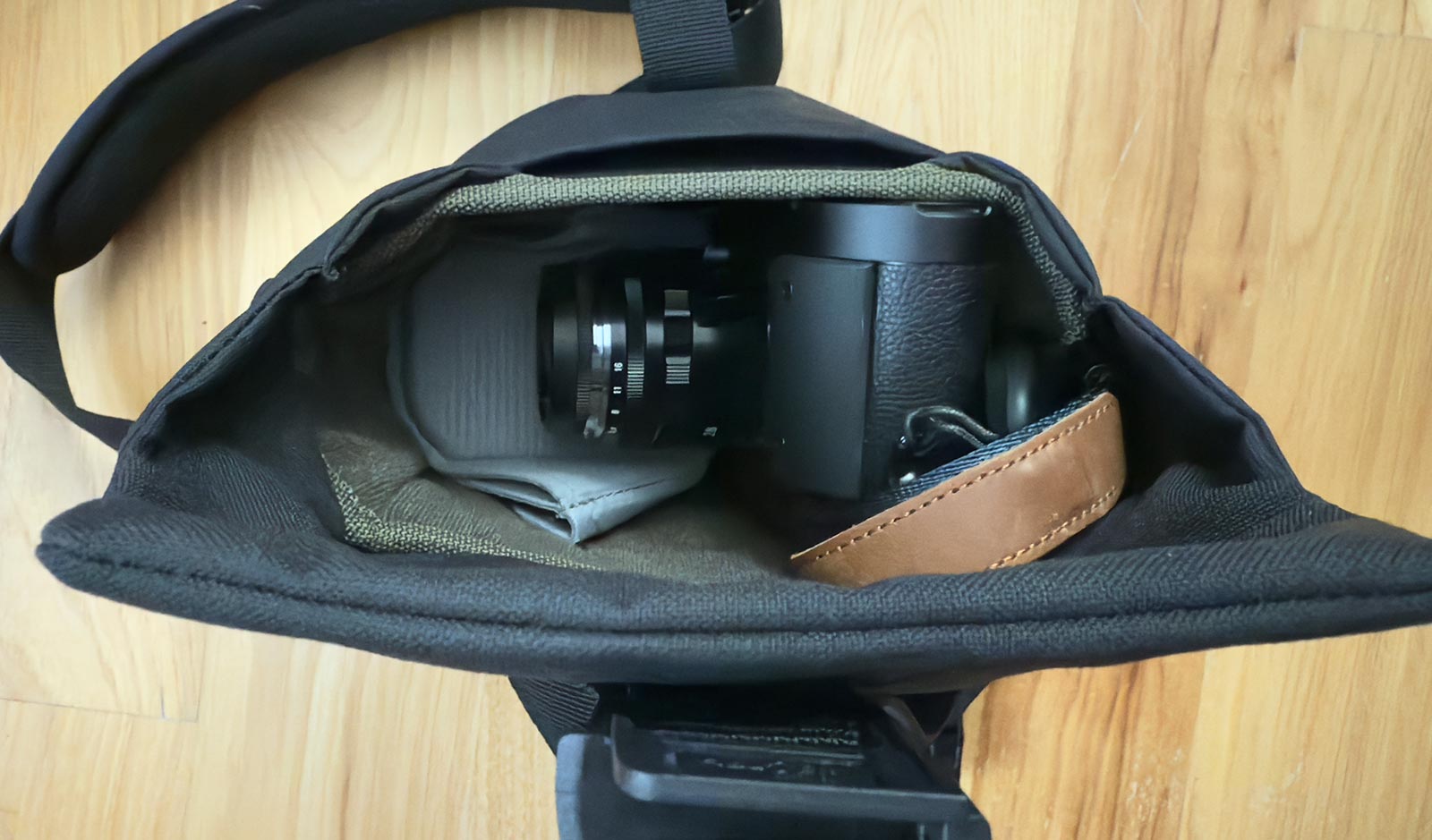
You are probably listening to some streaming service from your phone. Your phone may or may not have a 1/8" headphone jack. This is where the Qudelix-5K comes in. It’s a tiny bluetooth unit with a jack and a battery. You plug your headphones into it, connect it to your phone, and listen to music. Why is it so great?
Well first, it’s small and has a battery. Which means a) convenient and b) can drive most headphones. If you don’t know what ‘drive most headphones’ means, don’t worry. There’s a lot of stuff to say about impedances, sensitivities, and frequency responses, but there’s no real need to go there. I’ve not had any issues driving my low and high impedance headphones with this little unit. That’s not to say that there aren’t configurations that might have problems, but you are going to have to spend a lot of money to have issues. Weird, right? Buy the HD 6XX and you won’t have to worry. You might not have the same experience if you get some little 1/8" dongle to plug into your phone.
You can run the unit by connecting to bluetooth or by plugging in with USB. USB has lossless audio; bluetooth uses one of several bluetooth codecs.
The second great thing about the 5K is the EQ. There’s a 10 band parametric EQ where you can tweak your headphone’s frequency response. Don’t be a ‘purist’—take advantage of this. Every headphone has some inadequacies so you should tweak them to be more ‘flat’. You can look up curves in the Qudelix-5K app or program in your own.3 In addition, you can set an additional 10 band ‘house curve’ (and save different presets), so if you want to boost the bass or tame the treble, you can do that independently of the headphone adjustments.
This thing is a steal. Does it sound as good as much more expensive units? Maybe, maybe not. I can’t tell and you probably won’t be able to either. Will you get 2-10x the performance by spending 2-10x the money? No. This is one of the best audio purchases I’ve made in years and I highly recommend it.
-
I’m not writing this to get the extended warranty. This thing is serious bang for the buck. ↩︎
-
If you are happy with whatever ‘cheap’ setup you have, enjoy it. Don’t chase the dragon. ↩︎
-
Search for ‘oratory1990’ or look up ‘audiosciencereview [headphone]’ for reviews of your headphones. Then enter in EQ from the results. ↩︎